I want a website! I don’t want one that SUCK! What Should I do?
In the old days, at least during my time, the only option to show off your website was to create one on a web host with code. Then came desktop programs like Pagemill from Adobe that sort of help iron out the rough edges but that was no guarantee it would not suck! The problem back then was browser compatibility (it is still the problem now but to a lesser extent). The only way to bypass that was to use Adobe Flash (hence its popularity).
Since Adobe has scaled back on its support for Flash, it has become a veritable nightmare for browsers as a new breed of surfers emerge to take its place. These new breed of web surfers are now referred to as mobile web traffic.
Mobile Web took off in a big way in the 21st century. Data has to be transmitted and understood by devices with a peculiar set of protocols. In its day, WAP and Docomo’s i-Mode were highly popular and due to limited bandwidth on mobile, TCP/IP standard didn’t enter mainstream until much later in the late 90s thanks in part to EDGE/3G services giving you much faster data access. I won’t bore you with the details but responsive web design in the old days meant that you had to put up a WAP site along with your standard website. I-mode in was only happening in a handful of countries before it died prematurely in the hands of the iPhone. The iPhone in particular spearheaded the rapid demise of all other mobile protocols.
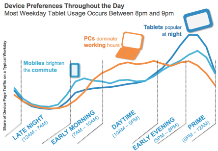
Now, why would you want to put up a website to meet the demands of both desktop web surfers as well as mobile surfers? Good question. According to Gartner and Cisco’s report, the dominant traffic of the Internet future will be from mobile devices!
- The Gartner Institute is projecting over one billion smartphones and media tablets will be sold globally by 2015
- Global mobile data traffic grew 70 percent in 2012
- In 2012, mobile data traffic was nearly twelve times the size of the entire global Internet in 2000
- Mobile network connection speeds more than doubled in 2012
- Average smartphone usage grew 81 percent in 2012

Responsive Web Design
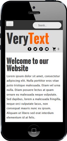
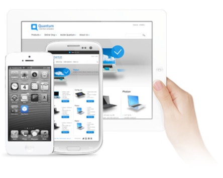
It sounds like a big term that only geeks can understand but really, it just means you gotta have a website that scales to size to meet the needs of a mobile experience.
Enabling Responsive Web Display for WordPress
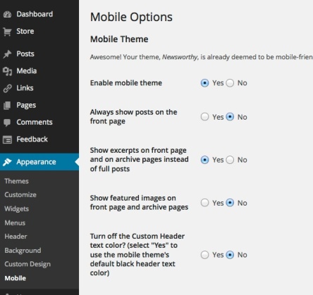
This is much easier to tackle if you are running the latest WP on your site. Just do the following:-
Go to your DASHBOARD > APPEARANCE > enable MOBILE
You can customize those options if you like and see how it goes. But beyond this, it’s not going to cost you anything else. Older versions of WordPress would take quite a fair bit of juggling with extensions, where a third party extension is used to enable mobile device viewing.
You’d be surprised how it looks in the end as the theme you use can be highly responsive to mobile displays to the point you can’t tell the difference between a mobile app and a mobile website.
Multi-Touch is not Included
You are bound to arrive at this point asking, what is the difference between a mobile app and a mobile website if you can’t visually tell the difference? Well here are some pointers to remember :
- Native mobile apps might display content in a similar way but on a native mobile app, multi-touch actions are supported.
- Mobile websites do not support the fancy transitions you often see on native Mobile apps. You need to code in HTML5 and use Javascript to have that capability. This requires coding knowledge.
- Native apps are hand coded. They do not use templates or themes, thus making them feel more unique to the end user and is totally Greek to the uninitiated who try to code one from scratch.
- Native mobile apps support for Social Media is seamless. The app can integrates more tightly with your content and social media feeds.
Remember how to Deliver your Content
Content matters. If you have lots to share, then you should put more thought into it but first know how often you are going to update it. If you are going to have lots of updates and plenty of content to share to engage your customers or fans, then it is better to start off with a CMS system with RWD enabled for your site. A mobile app is sort of a calling card these days even though they carry the same content as your website. You need to find out if you really need a mobile app to begin with.
Your content strategy should be sound. Customers are not going to download and install your app if all you do are annual updates.
Think for a moment, if all you are producing is vintage vinegar, and you don’t have much to share, then having a mobile app would be a waste of time. Even your Twitter feed will be empty until you have a fresh batch to announce for delivery.
Content has to be original and engaging and not just brochure-ware. The term brochure-ware is just that, a company brochure that has been regurgitated into an online form—which in this case would be your mobile app.
Don’t just create another mobile app just cause you think it is cool. Have a defined content strategy in place before you do as this is a very time consuming process. Content has to be curated or developed and if you don’t have the time to do it, then you have to engage people with the right expertise to help you.
Having a budget before you proceed is very helpful. Sort of like having an advertising budget, you carve out a part of that advertising budget to support SMO and SEO activities. Failing to do that will cost you even more time and money….and customers when you take them for granted.


